Label Design Commission
Crafted the way the whisky tastes.
Present, ambiguous, and impossible to ignore.
Client
VAME Malts
Year
2022
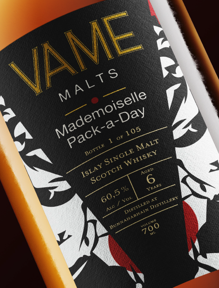
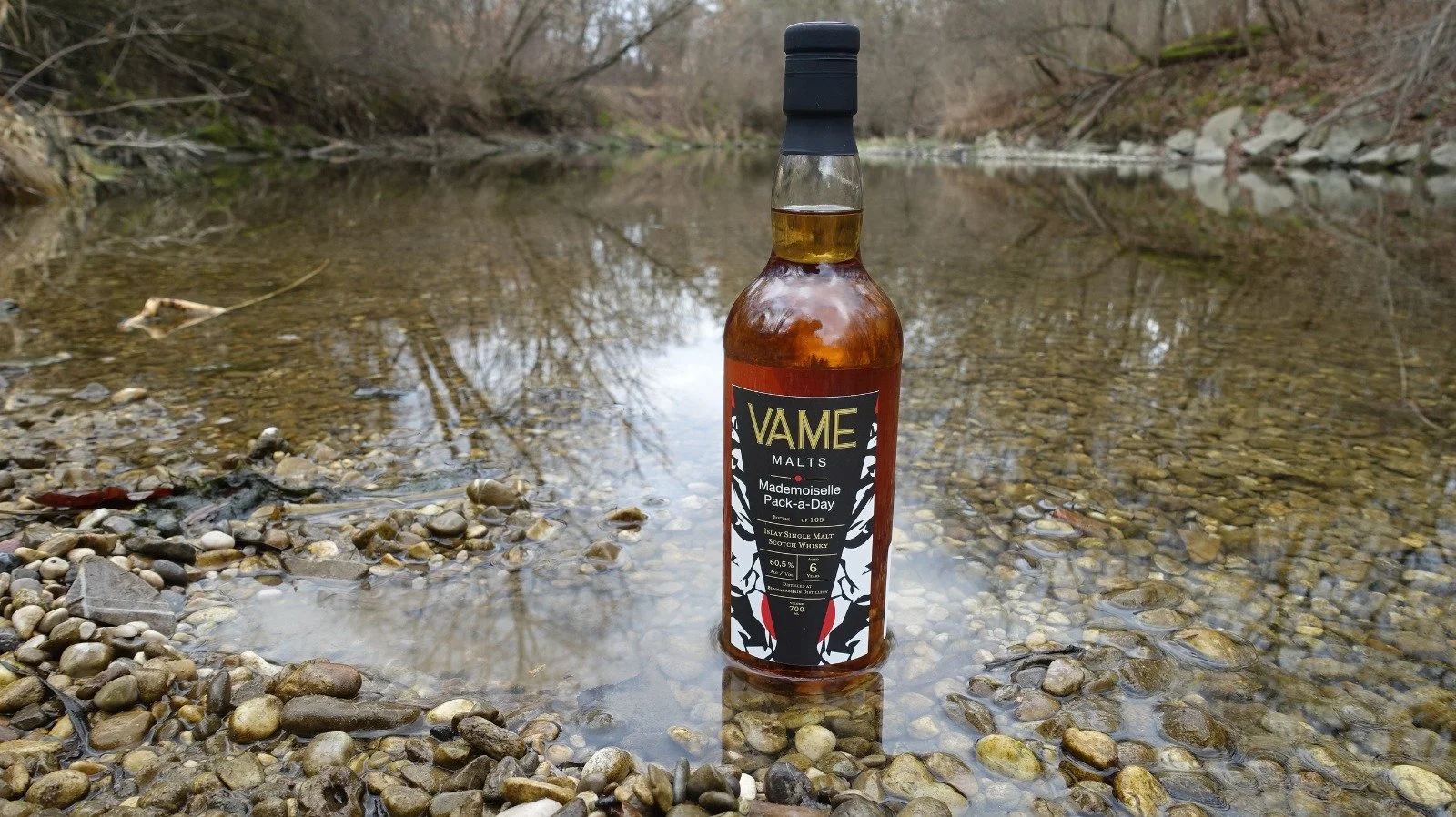
CommissionVAME Malts approached me to create packaging that could capture the story of a particular whisky. Not just contain it, more so capture it. The bottle in question: a single malt finished in ex-pinot noir casks, picking up smoky overtones from the French barrel's previous life.
The brief revolved around the whisky's character: edgy, high society but tough. Her name, Mademoiselle Pack-a-Day, conjured a specific image: a French snob who smokes all day.
Elegant, uncompromising, with that unmistakable smoky finish.
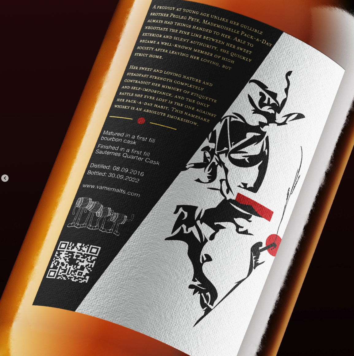
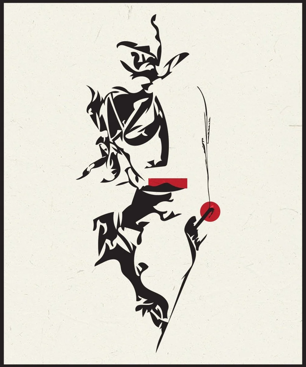
Visual ApproachI approached this as a visual puzzle. Using abstract compositions, I created something between presence and absence; a Rorschach test where you might see a woman holding a cigarette. Or you might not.
The image isn't declarative. It's not "here is a woman smoking." It's closer to "what do you see when you look at this?" When you hold the bottle and rotate it to see the full artwork wrapping around to the back label, the story assembles itself a bit more.
When you take a sip and it hits hard, takes full effect and the question shifts. What do you see becomes what do you taste, what do you feel.
Product